Tuesday, April 16, 2013

This is The Week!

It's finally our time to shine.


Since last week, I had to make a lot of little changes. I ended up saving out the character customization screen's assets out in such a way that ended up being a nightmare for Alex. After he was being visibly frustrated, I told him I would just save them out more conveniently. He was super happy about that. It saved him a lot of work and stress. Which makes me super happy too!


Furthermore, there was an ongoing discussion about the new spell GUI (on the bottom right of the player screen). Since we reversed the GUI to put the element on the right side of the screen instead of the left, the primary spells -- which previously matched the Q key to switch and Left Click to cast -- were on the right, creating a disconnect between Q and Left Click. After a lot of conversation between everybody about how much sense that does or doesn't make, I finally jumped in and just said I would just switch it and save out all of the GUI elements again so the GUI and the buttons line up once again.

I know I've said this before, but saving out assets takes a really long time. Especially if there's a lot of them, and a lot of different combinations of them. Saving these out again took about 45 minutes, I think, but it was worth it and had to be done. Now the primary spells are on the bottom (left) and the secondaries are on the top (right).

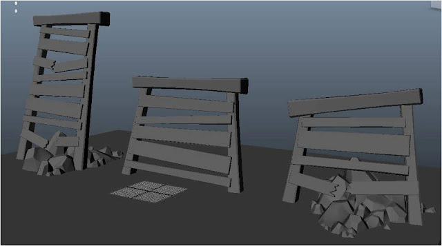
As for textures: the ice team finally has a rock wall!

The totems are finally done!

And we have a new ice brick wall!

There's a pause screen element, ohmigod.


I also made a desktop icon so we didn't have to see the default Unity icon when we wanted to play Mageball...

It doesn't actually work on the desktop, but whatever. Unity is fickle.

Also, I don't know if I ever even showed this finished screen. The statistics screen will display when the player hits Tab. So they can see their teammates, their team's score, how many goals everyone has scored, and everyone's ball time (amount of time they've had possession).


Now that the final build is done... I can say that we didn't get everything we wanted to in the game. There are still some things that could use polish. There are some things that are just default Unity things because we didn't have time to replace them.

BUT...

We are all super proud of what we've done. We all love Mageball. We didn't only work on this game because we had to, but because we genuinely enjoyed it and really liked working on it. So much love and work went into this game that we can't worry about the little things that didn't get done. In the end, we created something impressive, fun, and pretty.

I am proud to show this game on Friday. Absolutely. Knowing a few little polish features didn't get in will never take that away from me.

... Oh wow we're presenting this on Friday. Commence nervousness. I will be sure to post about it when the time comes.

Tuesday, April 9, 2013

Beta

So beta is due this week, which means the game has to be DONE aside from touchups.

Unfortunately, just because assets got to me super late, I was unable to texture everything before the due date. However, after these few textures I'm DONE (besides the touch-ups). I can't even wrap my head around that.


Before I get to anything I did, lemme just say Holy crap. Chris was doing touchups on the Drago Mines this week. And by touchups, I mean he almost completely redesigned it and now it looks freaking amazing. With all the assets in, it really looks like the mining facility we imagined. Everything looks like it's in its place. Even the crystals look good! I wasn't expecting such a dramatic change, but Chris did an incredible job.

Anyway, this week, I worked on the character customization screen a week before the final build is due (lolz). The system was already in place, I just had to create the assets before we could actually test it. I also had to re-save all of the different character textures out because we decided not to have the custom logo system after all. It just turned out that certain logos looked better with certain jersey patterns, so I just went through and saved out the jerseys with the logos I thought fit the best.

Here is a lineup of all of our pretty mages. :)


Then I textured as much as I possibly could with the time I had. Most of it got done before beta was due, but the untextured assets stuck out with their Unity-default-white ugliness. They were an eyesore in the otherwise pretty scene that was the new Drago Mines.


What's next is just texturing the remaining few assets, saving out the character customization assets, and going back and doing touchups wherever needed. This weekend our team is just going to go to the lab and stay there for the entire Sunday and then Alex is going to call it done (unless we need to do a few tiny things which is inevitable).

Oh, I almost forgot... I did a poster!

This poster is going to be what's on display at the Senior Show, and also... on Champlain's campus in the game lab for a long time. People are going to see my poster for years and years! :') 

I am very proud of how it came out. It went through about a hundred iterations. If you look on our Facebook group in our picture album, you can see way too many thumbnails of this.


Next week, the game is due on Wednesday. I mean the final build. I mean the build that's going to be on display at the Senior Show. It hasn't hit me that this is happening yet. Even with touching up my resume, getting my website near complete, getting my business cards printed, and demo reel done, I'm almost blissfully unaware that this is happening.

The concept of being the one on stage presenting this year is so unreal. People ask me a lot how it feels that I'm almost done and I'm like What? So at least I'm not nervous for the Senior Show just yet, but it also kind of makes me nervous that I'm not nervous.

Wednesday, April 3, 2013

Go Go Go

So much to do! How is there only a week and a half left? Time apparently moves faster when you're making games or something.

We are SCRAMBLING to get this done. Chris got his whitebox for the fire level complete, which was taking a while just because of how much work and design he had to put into it. (Oh, I'm not even sure if I ever mentioned that he was redesigning it to be a bit less narrow and wind-y.)

Sibyl and Kyle were missing again on our Sunday meeting because they were still getting back from the conference, so it was pretty hectic just being able to talk about what needs to get done and who needs to get it done.

Sibyl and I went into Chris's level and looked at where we could place assets. Originally, we were just going to have her do a phoenix statue to represent the fire team. There wasn't really a good place to put it in the fire level. Chris had the paths designed in a specific way, and clogging any space with a statue would have messed up the level design. Sibyl suggested that her time would be better spent on clutter assets. But then we had to discuss what the "clutter" would actually be.

Chris had been telling me the fire level should be a mining facility for months. And I kept saying No! I felt like there was just too much pressure on giving it a "theme." Like, why did we need a theme? It's a sport. The theme is sport. The field is a sports field. Just LET IT BE. But then Matt named the level "Drago Mines" and I overlooked the connection.

When Sibyl, Kyle, and I started talking about clutter I finally caved (haha get it because mines are caves) and decided to go along with the mine theme. It would make sense. If we did it right, the assets wouldn't get in the way of the level design. I wanted to go for a more abandoned mining facility, because it just didn't make sense to me why they would use an in-progress mine for a sports field... but I guess since this a magic sport, all rules are out the window anyway?

I ended up giving Sibyl a lot of wood assets to block off "passageways" into other mining areas (so players can't actually get there). These would also act as supports or frames for the cave, and mine cart rails. She also did a minecart asset. Kyle was finishing up his column with the mage in the middle, which ended up looking pretty awesome. He was also tasked with a hanging brazier for another light source and decoration. He had to finish his totems for the Energy Totem spell, too.


So here is what Sibyl came up with for this week (untextured)


And here is what Kyle did (also untextured):


It's funny when you accidentally completely forget about assets when you have t push them to the side for more important assets. And then you're like OH CRAP and have to rush to get it done when it very well could have been done weeks ago if you had the time.

I had to give Rob, one of our level designers, assets too. We had so many assets to get done that it was spilling over to the designers now. But he was more than happy to do them, and he actually did a great job!

Here are the assets textured.


Chris also had me do some tileable rock textures. I'll admit: I had no freaking clue how I was going to do this. I had done tileable cobblestone textures before. Tileable brick, tileable wood. But how do you even start with a tileable rock texture? What does cave rock even look like? Oh god what am I gonna do?

Internet to the rescue. Tileable rock, luckily, is a WIDELY discussed topic on game art forums, because it's an unspoken rule that every game dev has to make a cave at some point. Sort-of-unluckily, hand-painted cave rock textures are slightly less popular. There are a good few forums posts, though, that were endless help. I took a lot of inspiration from everyday game artists (like me), which drove me even more to make good textures. 


These took me a good amount of hours to do, each. I really got this hand-painted feel with these, maybe even moreso than I would have liked. It's a bit more cartoony than the ice level textures are, but I think when they are applied to the meshes they will look like they make more sense.

I have no idea how it got to be so late in the year already... We still have a lot to do, but at the same time we're winding down and that feels incredibly weird. 

Tuesday, March 26, 2013

GDC Week

We've been preparing for this dreaded week for a while now. The Game Developer's Conference in California stole away a bunch of the senior game devs. When we went into the labs to work this Sunday it was completely empty besides us, which was incredibly creepy considering the lab is usually full on the weekends. 

From our team, we're missing Sibyl, Kyle and Erin. Which means I'm the only official artist this week, and Alex is the only programmer.

I scheduled Sibyl to finish the character by this past weekend so I could use this week to just create a bunch of skins. There were some problems with the bake at first, apparently, so Chris had to fix it while Sibyl was gone. In the meantime, I decided to just finish up the new GUI and menus to have that out of the way and prepare for mass texturing for when my artists returned.

New menu screens! Alex made it so these fade out and switch every 60 seconds.

So it finally came to my attention after about seven months that health GUI is usually on the left side of a player's screen. I nearly headdesked I felt so stupid. I don't know how I didn't notice that before.

I switched the health/mana potion bottles to the left side of the screen. Alex, Chris and I stared at the GUI and debated for a while what the "background" of the potion bottle GUI should be. You know how it had that mage at the corner of the screen before? We decided to ditch that. There was really no reason to have it, and it was just taking up space. 

Again, I wanted to keep the GUI looking more simple than shiny, busy, or complex. I feel like this is not even something that's an opinion, because I've looked at tons of FPS screenshots for examples or inspiration, and all games have really basic UI. I mean it's usually white and another colour, and simple icons and numbers. This isn't something that needs to be complicated. It just needs to get the point across.

Although I realize the concern with just going with simple, I guess. We don't want the UI to look boring or nondescript. I don't want it to seem like I just went into Illustrator and made circles as a last-minute throw-away task either. The fact of the matter is, GUI is just usually not that complicated. And it doesn't need to be. 

Anyway, after Chris finished the character I got a few skins done. It went a lot quicker than I thought. Thankfully, I was actually smart about this and did it in such a way that the colours are layered. This way I can export from 3D Coat as a .PSD file with the layers in tact and just play with the colours as I please in Photoshop. It makes it a lot easier to make an ice uniform a fire uniform, and just change colour palettes in general. It also makes it possible to just layer the different patterns over a base design, so I don't have to paint everything all over again. Yay!


Our mage is lookin' cute. :)

Also, thank god for Chris Sydell. He's been such a savior. Since we had a new character, we needed new animations. Doing all of the animations all over again was going to be a huge task. I asked if it was possible for the animations to just transfer to the new character, but I got a No. But then Chris managed it and then suddenly we had all of our animations back in one night. PHEW!

I am totally ready for this week to be over. I don't think you understand how stressful it is to be missing all of my 3D artists this week when we only have two weeks to fully complete the game... Wish us luck PLEASE!


Tuesday, March 19, 2013

Whitedagger Pass

This week was definitely a busy one for us. Especially us artists. We worked our butts off to get Whitedagger Pass art complete so we could get ready to work on the Drago Mines.

As Sibyl and Kyle were churning out models, I was churning out textures, and the level designers were putting everything together very nicely. It was kind of a messy process, simply because the assets were getting in late. We were all kind of scrambling and pulling late nights just to get it done. As Chris was getting his models and terrain done, he was asking for impromptu textures for different kinds of snow. I also had to jump in and do a few models because everyone else was so busy with everything!

Sibyl did an amazing job with the buildings for Whitedagger. Oooh are they beautiful! These were much better than I even expected. She really went above and beyond to not only make them look good, but they also fit together in different modular ways, and there's also a great variety (so it's not just one building model scaled up or down). 

I knew the textures had to be spot on for the buildings. The colour palette was crucial, because Whitedagger Pass -- being primarily ice and snow -- is a mostly blue/white level. It was vital that the colours of the structural elements around the level -- like wood beams, stairs, and buildings -- were perfect accents to the overwhelming blue and whiteness.

I made a bunch of different colour palettes and applied them to the buildings and presented them to the group. After some voting, it became pretty clear that the buildings had to be brown to contrast the snow and ice. I kept some elements blue for decorative-detail-accent purposes. Making the buildings all brown would just be too monotonous. 

Here are all the building pieces together!


Also here was my brick texture that you see everywhere:

This started as cubes in Maya, which I brought into ZBrush to sculpt. I then exported the high poly models back into Maya and arranged them in a brick pattern. I projected those high poly models onto a plane to create a normal map.


After Whitedagger got its extreme makeover, a group of us headed to the labs to take screenshots and enjoy our pretty level. We ended up taking like 200 screenshots all together, because we needed a really good one to put in our Senior Book.


This year, Champlain is sending out a Senior Book for recruiters interested in our graduates. We did personal ones which pretty much acted as resumes, and then we had to do one for our games. 

I know this is going to benefit me later on, and the faculty is just trying to make it easier/better for recruiters to hire us, but sometimes it feels like this stuff is getting in the way. I know Alex (primarily) is working on this document, and he barely has enough time to do the other work he's supposed to be doing. Stress doubles every time you have something new to work on. 

Anyway, we also released an art spotlight video on YouTube for the new Whitedagger Pass. Here it is: 


Furthermore, I did some work on fire level assets that Kyle started work on. We've still got a TON of stuff to do. It's a good thing we dropped that third map...

Wednesday, March 13, 2013

Spring "Break"

If there's one thing I've learned in college, it's that breaks are always too short. Even when they're three months long.

Over break, I planned on getting all of our menu assets done so that when I came back, I could fully focus on our texture art. Another thing I've learned about break: there's always a lot of stuff to do that isn't schoolwork. I didn't get ALL of it done, but I was happy with what I did get done.

Start Game Screen
Before, we had little banners that just had the name of the spells and then you would pick your team. It was uuuglyyy. We needed something that was 1.) prettier, and 2.) had more information.

We had to let the players know what the spells' mana costs were. We also thought it would be good if players could see what other players have joined the game, which team they were on, and the spells they have chosen. 

The two spells chosen will have the glow effect pictured here. The team picked will glow (as the fire team is here), and then the "Ready" button will be active so the player can join the game. Not pictured is a little mana pot with the mana cost right next to the spells. 

QA testers apparently enjoyed the new menu art, and were pleasantly surprised when this popped up instead of our old, bad banner buttons.

The other artists were working hard over break trying to get all of the assets for the ice level complete by Sunday so I could get to texturing as soon as I came back from break.

Sibyl's stag statue came out AMAZING!

I hand-painted the stag in 3D Coat.
The stag in-engine with Chris's master shader that allows for translucency.
Looking majestic huh?

Kyle's done a lot of assets, and here's what I've textured so far:

Wall banners to put around the level and show team pride!


Torch for the ice level.
A brazier cleverly themed for the ice mage's stag.